KELLOG INTRANET
BRANDING – ANIMATION – COPYWRITING
In 2021, Kellogg’s launched a redesign to coincide with the relaunch of its intranet platform, K-Connect. K-Connect felt its pre-existing visual identity wasn’t reaching its full potential. As a platform that aimed to allow employees to better engage with one another, build community, and streamline processes and communication—there was an opportunity to design a visual identity that better represented its ideals.
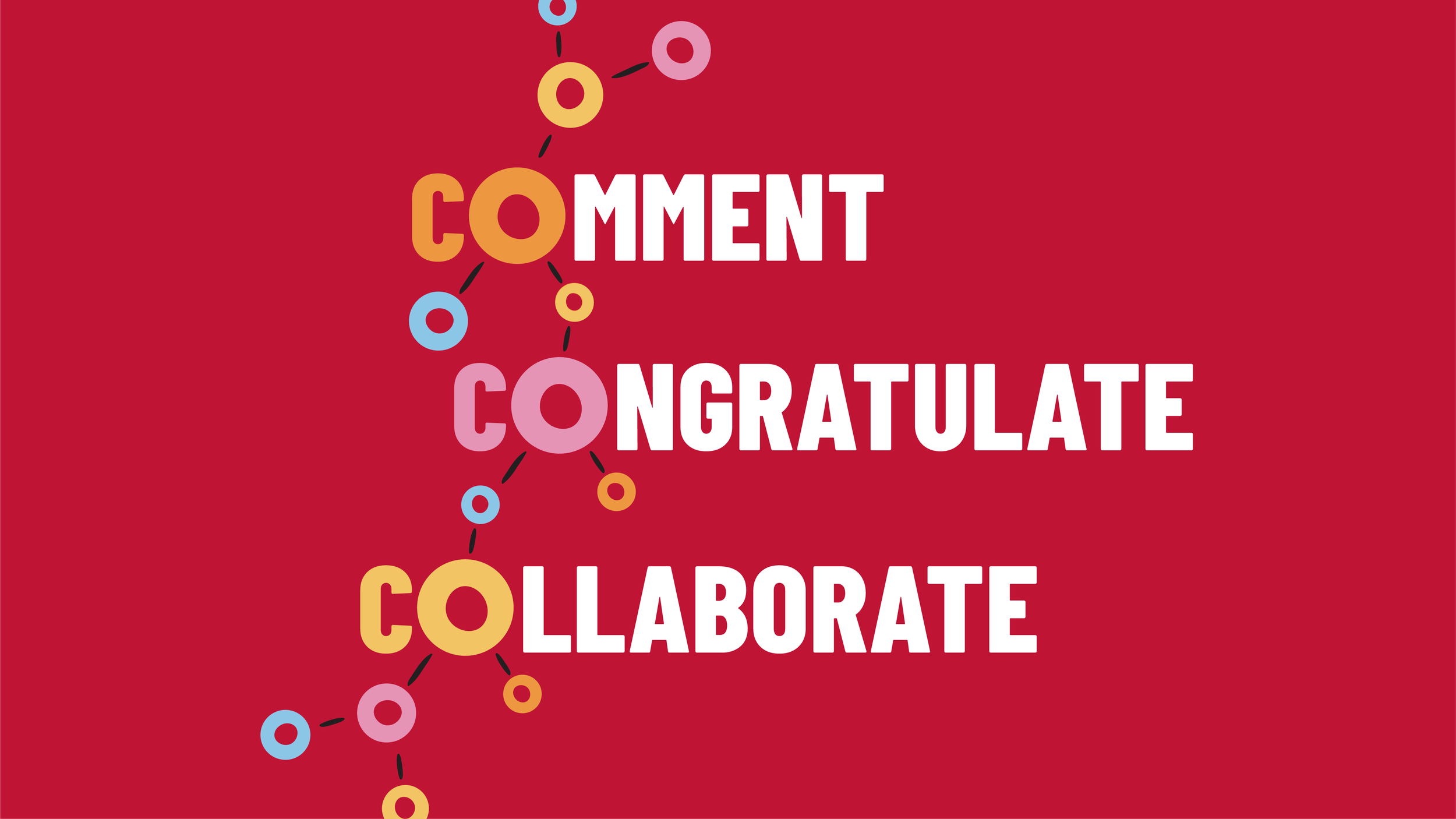
Design B&B crafted a verbal strategy and story that captured the core purpose and values behind the K-Connect relaunch. By focusing on framing its role in the improvement of the employee experience and leveraging key iconic assets and brand characters—a system was created that expanded on the Kellogg Employer visual and verbal brand.
Deliverables included a complete visual and verbal identity, verbal and visual strategy brand guide, and a set of launch materials: a 2-minute explainer animation, digital marketing materials and a digital interactive competition for employees.
The big reveal of the new intranet was teased by a shorter 30-second animation (above) that addressed some of the pain points of employees and got them excited for something new.
The 2-minute explainer animation that followed detailed the changes and improvements made to the intranet and its purpose. The process of creating the animation involved an in-depth storyboarding process that required collaboration from our team to bring together visual, audio, and script.
The final deliverables included an article with branded visuals, email banners, a KConnect brand guideline, and a scavenger hunt that would get employees to get acclimated to the new intranet platform using a point system and rewards as incentive.


